
After 2002 and 2011, Melodifestivalen has wanted to refresh itself. Let’s learn how it happened!
We wanted to refresh ourselves before the old logo is starting to feel old. The logo that we have had since 2011 has worked very well. But has been difficult to handle in the press and other media. Now we wanted the one that works on a wider scale. We also wanted to get this logo at the same time with the 15th anniversary of the modern version of the Eurovision Song Contest. There is no permanent logo, but this is the one which is going to stay for a while.
Melodifestivalen editorial knew earlier that they wanted to change the logo to have a more flexible symbol.
‘’The first thought was to make a minor change in the one we had. But we had a vision of a greater change of the design. Dallas appealed to us for much more that we wanted it.’’ says Anette Helenius.
Before 2002, the Eurovision Song Contest used to change their logo in every year. Only then, fifteen years ago, the festival received a fixed symbol.
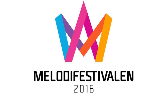
‘’We showed the new logo to the people who are living in the town and asked them if they could recognize the brand, and nine out of ten said Melodifestivalen. They thought they saw a crown and M.’’ says Anette Helenius.
M that we lost before. It was in the original logo from 2002. But the new should not be viewed as a letter but a as symbol. Some people have interpreted it as streamers and some as a symbol of eternity.
CAN BECOME A SCULPTURE
Anette Helenius see several exciting new opportunities with the logo.
‘’We believe that it is much more responsive in social media, apps, sponsor materials and merchandise. In the long term, there is much can be done. One could develop it as a sculpture: it could take a place in the room.’’
When the festival has a fixed symbol in 2002 it was in the form of an austere. For 2011, the same one in a more playful version.
‘’We have not weighed in the new logo is playful or serious, but instead assumed our values. Prior to 2015, developed a brand platform gave us confidence in what the festival should be: warmth, joy, excitement and courage. When we tested the logo many people said that it is strong and stand up for herself. Many watching feeling that they are happy, and the colors bring to mind the Eurovision Song Contest.’’ says Anette Helenius.
The new logo will also be available in the color black and white versions.
‘’We see in the first place that is the colorful one will appear. The solid color may be used in specific contexts, for example if you want to print on a red carpet.’’
With a new logo will also be new looks at the graphics on the TV screen when the scoreboards. Drip patterns that have existed will disappear and there will be new animations. But the the font that appeared in broadcasts earlier forms, will appear the text under the new logo.
‘’Now we have tied up the TV graphics with the text of the logo.’’ says Anette Helenius.